Saturday 26 November 2011

Greek manufacturing : is internal devaluation working...?

I’ve been thinking about the performance of Greek manufacturing in the context of the internal devaluation strategy, again. I want us to take a look at a couple of charts. Here’s the first one.


source: Eurostat

If one focuses at the turnover index for Greek manufacturing he would think that the sector is actually doing rather well. The said index has the drawback that is affected by prices’ fluctuations. I personally prefer volume or quantity indices. The readings of the volume index paint no pretty picture though. The index was in constant decline since late 2008, though it seems to have stabilized during the past few months. It remains to be seen whether this is another head-fake before it resumes its downward path or if this is here to stay. Hence, the rise in turnover comes in its entirety (even to make up for declining volumes) from price increases. 

The Irish manufacturing sector seems to be faring considerably better. Volume didn’t decline much during the dark days of 2009 and the brunt of the adjustment was borne through lower prices. Furthermore, prices have been relatively stagnant for the most part of 2010 and 2011. 


source: Eurostat

For you to have a clearer picture of the evolution of prices in the sector, other than my ramblings, here is producer prices’ evolution over the past 4-5 years.


source: Eurostat

The chart confirms that over the past two years, producer prices for Greek manufacturing have been rising steadily and heavily, while the ones for the respective Irish sector have been at best flat.

A good question is, why?

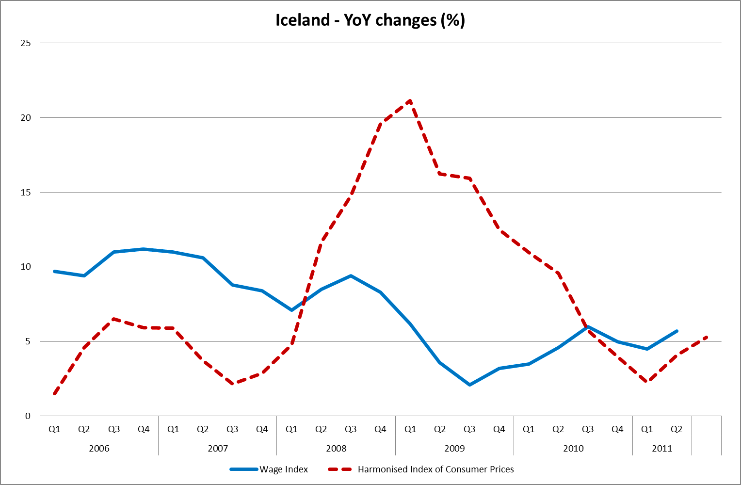
Is it because of the internal devaluation? Have wages in Ireland declined more than the ones in Greece did? The next chart can answer that. 


source: Eurostat

It seems that wages for the Greek manufacturing sector have declined considerably more than the ones in its Irish counterpart. It would be more correct to compare real unit labour costs (ULC). Irish real ULCs have declined a bit more that the ones for Greece 5,45% compared to 4,43% annualized, probably due to lower inflation in Ireland and the fact that productivity fared better in Ireland than in Greece. But then again this is no significant differential to speak of. Then what can account for the anti-diametrical picture displayed in the producer prices chart?

Manufacturing firms are capital-intensive, aren’t they? That must mean that labour inputs are not the single most important cost-factor for them. The price of their material inputs along with cost of capital should be. A look at an industrial firm’s balance sheet should be enough to verify this (again the degree of capital intensiveness is different for each sector).

But material inputs prices are the same for everyone, right? I have talked about the level of import prices in an older post. Moreover, if you put the credit crunch and the state of each country’s banking sector in the picture, the cost of capital starts to diverge as well (of course a possible credit crunch could affect import prices as well).

In my humble opinion though, the single most important factor is what comes next. Analyses, like the one above assume that the level of sophistication of even the same sectors in each county is the same and more importantly that all countries produce the same basket of goods.

Well, they don’t, hence in most cases they are not directly comparable to each other. They source different inputs, which can only mean that they are affected by different factors or even by the same factors just in a different scale. 

In that older post I had blabbed about how the timing of attempting an internal devaluation on Greece is unfortunate due to the fact that commodities prices are high. I hadn’t put that into numbers but I’ll give it a try now.

Look at how dependent the Greek economy is on oil.


source: Eurostat, ECB, own calculations

The R2 of that rather simple regression is shocking really. Look at what the same regression for Ireland, this time, yielded.


source: Eurostat, ECB, own calculations

That, in part, could explain the different behavior of producer prices in the two countries and add weight to the argument that the internal devaluation is unluckily pursued at a time of high oil prices.

Oil prices are exogenous but the fact that the Greek manufacturing sector and the economy in general are overly reliant on oil is not…

By all these I don’t mean that if oil and commodities prices in general were lower, Greek manufacturing would be doing better (this is a function of so many factors that I can’t even dream of writing them down), but would the sector’s products prices be in a downward trend? Moreover, that doesn’t mean that should that be the case, internal devaluation could be characterized as successful, nor would it mean that it would be less painful. The Greek external sector is so small that, in my humble opinion, all kinds of devaluation strategies (currency or internal) would probably need a long time to bear fruits.  

P.S. I want to share one more weird fact with you. Usually there is a lag until oil price spikes are passed through to producer prices. What I was astonished to see is that this lag for Greece is virtually non-existent.


source: Eurostat, ECB

P.S.2. Some more evidence of the higher dependence of Greece on oil.


source: IMF

Wednesday 23 November 2011

The effect of currency devaluations on external debt : the case of Iceland

I want to take a look at one particular consequence of currency devaluations. The effect they have on external debt. 

The case of Iceland is quite revealing in this respect.

Since external debt is mostly denominated in foreign currency (in most cases that is, not always), when expressed in local currency terms, it balloons after currency devaluations.

At first I intended to include data about the defaulted banks’ external debt which comprises the lion’s share of total Icelandic external debt. Since the issue is a bit controversial I decided to just include General Government’s external debt, which is not defaulted upon. Here’s the chart.


source: Central Bank of Iceland, Statistics Iceland, own calculations

I think that the chart’s enough to showcase the effect of the Krona’s devaluation on external debt...

P.S. I should mention that the Krona depreciated all through 2008.

Thursday 17 November 2011

Currency devaluations: is the case of Iceland what it appears to be ?

I’ve been thinking about currency devaluations lately so I thought that I should take a look at the most talked-about recent case of currency devaluation, the Icelandic Krona, along with its effects on the Icelandic economy. 

Here’s a chart of the Krona vs. the EUR and the USD.


source: Central Bank of Iceland

As the chart makes obvious, the Krona was devalued enormously during 2008. Popular wisdom wants currency devaluations to be expansionary, but actually literature on the subject is mixed about that. I just want us to wonder if there is such a thing as a free lunch. If currency devaluations were that beneficiary with no strings attached then everyone would choose to follow that route, wouldn’t they?

Before expanding on the subject I want to say something. A common comparison that a lot of commentators draw on is between Ireland and Iceland. I think that this comparison is simply wrong, since we are talking about two economies with totally different fundamentals that just happened to be plagued by two common malaises, a property bubble and an oversized banking sector with risk-heavy balance sheets. That’s not enough to make them quite the same, is it? But for the sake of argument I’m going to include Ireland in some of the charts since I think that even these arguments are overplayed. I will explain  what I mean by different fundamentals later on.

First of all let’s see how Iceland fared growth-wise. Here is a chart of Iceland’s real GDP growth.


source: Eurostat

Iceland devalued during 2008 but recorded positive real GDP growth only in 2011. A good question is what happened then. We’ll answer that later.

The reason why the currency devaluation by itself was not adequate for Iceland to get back on the growth wagon is probably that Iceland’s external sector was not big enough to bear the growth burden by itself and that the recessionary forces were too strong (exorbitant external debt played a role too).


source: AMECO, own calculations

Everybody’s first thought when hearing about currency devaluations is exports. Here is Iceland’s exports chart. 


source: Eurostat

The year that the Krona devaluation took place, 2008, exports spiked significantly but this was mostly due to increased aluminum exports, a trend already in place for some time. This has nothing to do with the devaluation since it is associated with large scale investments in the aluminum sector launched in 2003. Besides aluminum, capital goods contributed significantly to total export growth in 2008 but stagnated after that.

The J-curve effect states that any positive effects from the currency devaluation on exports materialize with a time lag, at least that’s what happens in most cases. The J-Curve effect also states that before exports start growing, a brief slump might be recorded. Maybe that can explain the slump in Q4 2008. In 2009 exports grew by 7,2% in real terms according to Eurostat’s data but according to actual quantity data from Statistics Iceland, exports were mostly flat (as you can see in the chart below). In 2010 export growth in real terms eased even more, while it was stagnant in actual quantity terms.

Most product classifications didn’t grow at all post-devaluation and many even declined quantity-wise. Here’s a chart about the major contributors to export growth (again quantity-wise) the years in question.


source: Statistics Iceland

All in all, if my ramblings above are correct, the Krona devaluation didn’t help Icelandic exports as much as it is heralded (always in actual quantity terms) and the adjustment that took the country’s trade balance into surplus territory originated mostly from the import-side (i.e. decrease in imports). Moreover, I think that Iceland was “unlucky” that the first year, after the devaluation took place, coincided with the worst (or is that the only?) slump in international trade in the past few years. 


source: Statistics Iceland

One more thing that was talked about extensively in the economic press or wherever else, is that the devaluation option was not that painful. Well, I will put on a few more chart (hope you are not asleep by now) so that you can reach your own conclusions.

Here’s real private final consumption expenditure for Iceland.


source: Eurostat

Does that monumental decline in real private final consumption expenditure seem painless to you? Also this is the answer to the question that I posed in the beginning of the post about what happened and Iceland started growing in 2011. Private consumption expenditure started growing, that’s what happened.


To give you a clearer picture, here are Iceland’s real imports.


source: Eurostat

The time that monstrous declines in real imports started being recorded, maybe can help us in the task of timing when the effects of the devaluation started kicking in. That time is Q4 2008, like we had speculated above. 

Of course, private consumption didn’t start growing out of the blue in 2011. The main catalyst was that real wages started growing. Since private consumption was heavily depressed during the previous couple of years, it could that some low-base effects are at work here too, but only time will show what is what. 


source: Statistics Iceland, own calculations

One last thing. One of the problems associated with currency devaluations is that the country “imports inflation”. The prices of inputs rise and if that is transformed to an inflation-wages spiral then any devaluation-induced cost advantage could be wiped out shortly. One-off devaluations don’t have that effect usually but continuous devaluations tend to do just that.  

What that means is that for devaluations to be effective real wage growth has to remain subdued, which again means pain for people. Another option exists and that is keeping the exchange rate depressed through the accumulation of foreign reserves, but that contributes in keeping private consumption weak as well. In my humble opinion for a devaluation to have a lasting effect on growth and exports, countries that choose to follow that strategy must work hard to increase investment or if that’s not possible then to attract foreign direct investment (FDI), or even both. Last but not least for any devaluation gains to be long-lasting the country has to adress any structural problems it has.

Currency devaluations are not as suitable for all countries. Countries with a large external sector that one-off factors had contributed to its current-account being in the red for a few years, could relatively less painfully, adjust through currency devaluation. Countries with chronic competitiveness problems and miniscule external sectors could find that currency devaluations are extremely painful. This is just one policy path that could help the current account swing into surplus, as is internal devaluation. Both of them though involve severe economic and social pain…

P.S.1. Since I don’t have any special knowledge about Iceland all these could be simply wrong, so if anybody that possesses more knowledge on the subject thinks that I don’t know what I’m talking about, please say so in the comments section and enlighten me about the actual situation.

P.S.2. I mentioned Ireland's fundamentals, here is the relevant chart. One look at it makes obvious what I meant by different fundamentals.


source: AMECO, own calculations


Thursday 10 November 2011

Greece and Ireland : flow of funds edition

Just a quick post today. I was curious to see what selected Balance of Payments data show about Greece. It is undoubtable that funds are flowing out of Greece. But what about Ireland? They are in a crisis as well so their fate must be similar to ours, right? Well, wrong...

Look at the following chart about Portfolio Investment. Ireland is depicted in the left hand scale while Greece is shown in the right hand scale.


source: Eurostat

Funds are indeed flowing out of Greece while outflows from Ireland have halted.

Now let's look at inward foreign direct investment (FDI) flows for the two countries. 


source: Eurostat

Again the situation in Ireland is exactly anti-diametric from the one in Greece.

I don't know if this trend will keep, since things internationally are at best shaky and fragile (and we know that international flows are easily reversible and volative) but its presence indicates that crises do not play out the same way for all countries. Of course this is not attributable to fate or luck...

Monday 7 November 2011

Fiscal adjustments in the Euro Area: Greece and some other cases

Although I suspect that the latest developments in my native Greece has kept and is still keeping us all busy, I decided to write a post tonight, since it's been a long time and my keyboard fingers are getting itchy...

I was shifting through some data about fiscal policy today and it suddenly struck me how eloquently all the current problems of Greece are reflected into the next chart. 


source: AMECO

As you can see, general government's total expenditures (as a % of GDP) have never actually declined in the years that AMECO data run, appart from the current adjustment.

The previous fiscal adjustment (pre-EMU accession), which admittedly was rather large, in its entirety came from the revenues side of the state budget. It comes as no surprise then that for many people this seems totally outlandish.

Another thing that we can discern from the chart is that post EMU-accesion fiscal policy in Greece was, for the most part, pro-cyclical.This only serves to make booms more spectacular and busts infinitely more painful. The fact that the pre-EMU adjustment was counter-cyclical in nature (even though it was revenue-based) made things easier (as did the fact that the reason for it was the up and coming EMU membership, which the majority of Greek people regarded favourably).

A period when many large fiscal adjustments happened simultaneously, was the run-up to the Euro introduction. I want to take a look at some of these cases and more specifically at the structure of these adjustments.

Let's start first with the southern Euro Area countries. Here's Italy.

source: AMECO

As you can see from the chart, the brunt of the adjustment in Italy came from the expenditures side of the budget. Now let's take a look at Spain.


source: AMECO

Here too, general government expenditures accounted for the entirety of the adjustment. After EMU accession Spain kept a rather prudent fiscal stance, helped in part by a spike in general government revenues (could that be attributed tot he property bubble?).

Now, let's take a look at some northern/central Euro Area countries. First one up is the Netherlands.


source: AMECO

As the graph makes obvious, expenditures were slashed to meet the accession criteria. Revenues were broadly unchanged or even declined slightly. After the EMU admission hurdle was cleared, the Netherlands followed a clearly counter-cyclical fiscal policy, that allowed it some room for fiscal maneuver during the present crisis.

Now let's take a look at Belgium.


source: AMECO

One first takeaway fromt he chart is that for a rather long time Belgium ran huge fiscal deficits, that at some point in the 80s reached the stratospheric level that characterized Greek budget balances in the 80s as well. After that there was a first wave of adjustment (during the 80s) based mostly on cuts in expenditures and a bit on revenues (but towards the end of the decade revenues fell again). The second wave of fiscal adjustment was enacted in order to meet the EMU admission criteria and it was more balanced than the previous one.

Finally, here's Finland, which I think is a really interesting case.


source: AMECO

Finland experienced a banking crisis in the early 90s which coupled with the wilting of traditional industries like forestry and the collapse of the USSR (that was a significant trade partner) resulted in a really deep recession. Since the country adhered to a counter-cyclical fiscal policy prior to the early 90s crisis, was able to ramp un government spending to unprecedented levels in order to support the economy in these hard times. That only meant that a monstrous adjustment was required for the EMU accession criteria to be met. All of it came from the expenditures side of the ledger.

All of the adjustments reviewed above, despite their different structure, had one thing in common they were countercyclical (they were imposed when the economy was expanding) hence the whole process was less painful.

Of all the cases shown above, the Greek case is unique. It is the only one that general government expenditures were left untouched.

I think that all the above highlight the merits of counter-cyclical fiscal policy...

P.S. Here are the real GDP growth rates for the countries displayed above in case you want to check out whether revenue-based adjustments were less painful than expenditure-based ones. There is no evidence of something like that, nor did the countries slip into recession because of the adjustments undertaken. Moreover, Finland that undertook such a large expenditure-based fiscal adjustment didn't find itself in a depression because of that (and even if growth during the first year out of the recession was due to a low-base effect what about the next years?). Of course, these adjustments are not comparable to the current one attempted in Greece due to the fact stressed above they were counter-cyclical while the current one is pro-cyclical.


source: AMECO


source: AMECO


Of course, in no case can the real GDP growth that each country displays be attributed solely to its fiscal policy but to a million other idiosyncratic factors.